Why The Change?
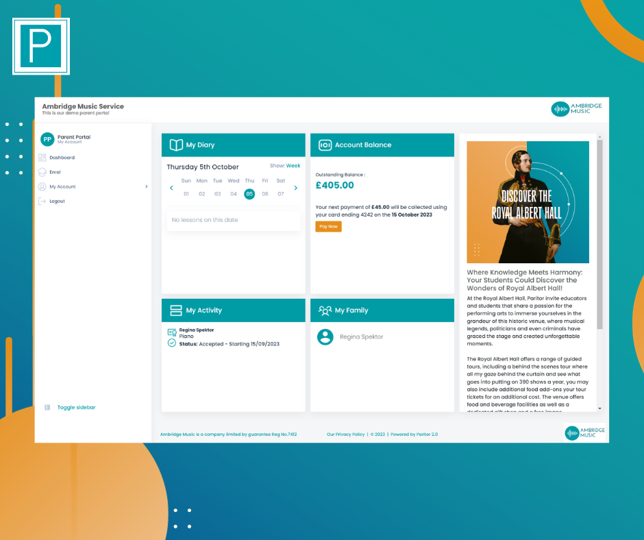
Our decision to revamp the Xperios Portal was rooted in our commitment to providing you with a harmonious and enjoyable user experience. We’ve hired a new member of the team, Will, an experienced designer, to focus these designs. While the core functionality remains the same, we wanted to make it even easier for you and your customers to navigate the Portal. The updated user interface brings a fresh, clean and harmonious design that is not only visually appealing but also ensures information is presented in a more digestible way
What's New?
We’ve started by updating the dashboard. It’s now a streamlined user experience. Navigation of the site has been updated to make finding items and accessing features easier than ever!
Menu Location
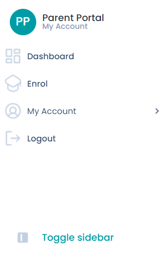
While the functionality remains the same, menus have been moved for a more intuitive experience. The Menu has been moved to the left hand side of the screen, automatically showing in an icon view. Customers wanting to see the menu names can do so by simply clicking the Toggle sidebar button at the bottom of the menu.
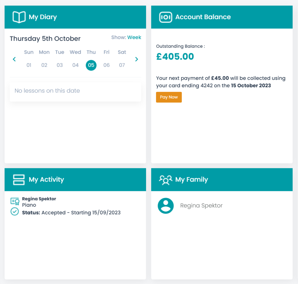
Dashboard Items – The sections that made up the existing dashboard are now arranged in a visually appealing way, that expand with information.
New My Diary – You’ll see a new diary view within the dashboard, showing what you’ve got scheduled for the day or the week.
New My Family – Introduces an overview of your family, which you can click on to go to their personal information.
My Activity – This is now a concise, user friendly summary of your children and what they are studying.
Whilst we’ve been making these changes, we’ve ensured that the Portal is still optimised for all devices. Whether you’re using a laptop, tablet, or mobile device the new design adapts seamlessly to different screen sizes.
What Else?
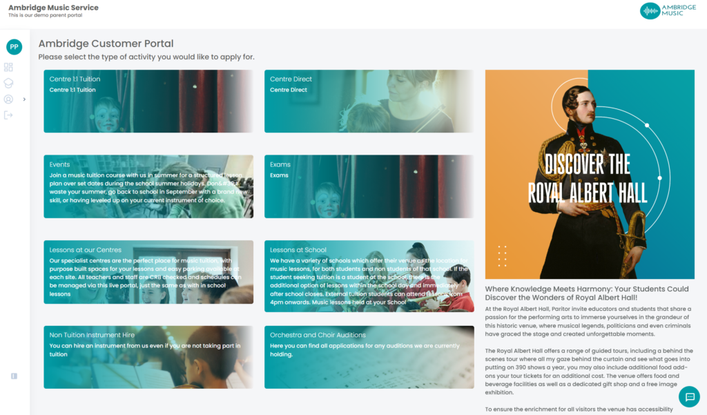
The new Portal boasts a clean and fresh design that not only enhances the aesthetics but also makes your user journey more enjoyable. Not only do we have an updated Dashboard, but the Enrollment Screen has had a lick of paint too! It’s the same images and text but with an updated look.
My Finances has a new look too!
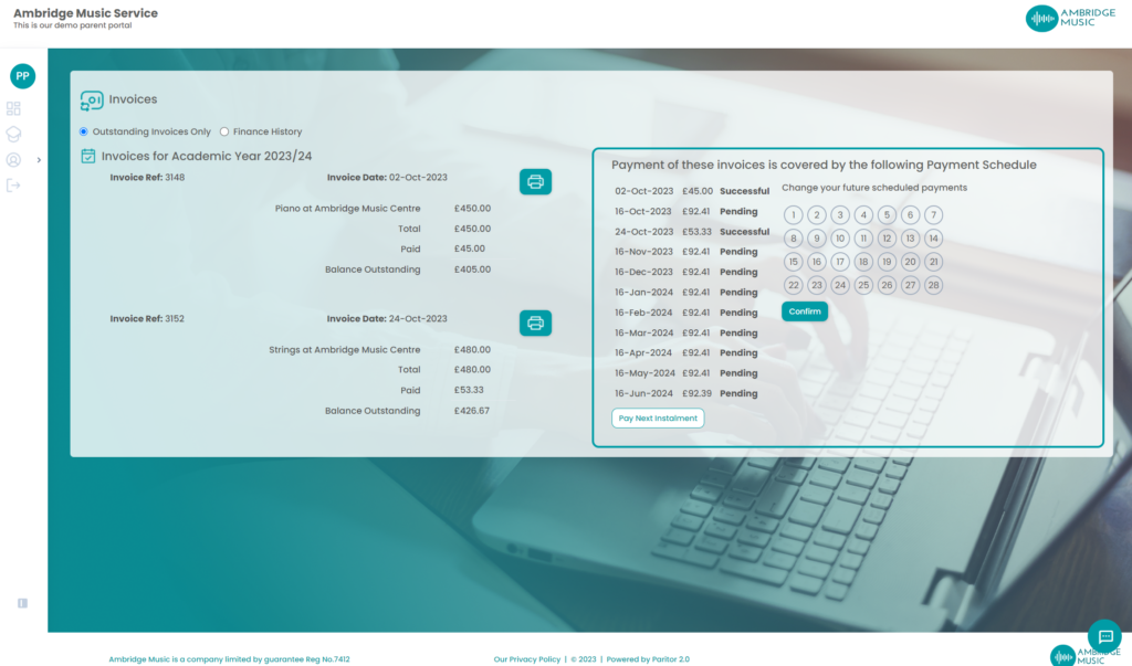
With a breakdown of invoices on the left, with details and options to Print and Pay Balance, this view is much more user intuitive. Customers with Payment Schedules can also see this on the right hand side. Customers can even opt to change the schedule date by clicking the calendar and selecting a new day of the month that they would like the payment to be taken (that is within the payment due date parameters).
Please note, customers can only change a payment date in the portal if they make a payment. This ensures cash flow for your business and prevents any situations where customers simply keep updating the date to avoid paying. . This will update all future payment dates as well. Customers can also select to Pay Next Installment early
Need More Information?
Our Online Help Guide has been updated with our recent changes and how they work.
Take a look here to find out more.